Pages

Wednesday, August 27, 2008

I <3 Burdastyle

I just got to go to an open studio/party at the Burdastyle office! The purpose for the party was to celebrate the site reaching the 100,000 member mark. in case you haven't heard of it, Burdastyle.com is a website that produces open source (=copyright free) sewing patterns and functions as am online sewing community. 

The founders Nora and Benedikta are very sweet and enthusiastic! They are basically running this site with a very small staff and a lot of creative energy so the open studio was an opportunity for them to meet some local members and talk about the site and our crafting habits, wants and needs. They even convinced me to talk on camera a bit... terrifying, huh? One of my favorite parts about the open studio was being able to look at all their samples up close to see the finishing techniques and feel the fabrics they used. I also got to see some of the new design ideas for the upcoming months... exciting stuff. 

In addition to meeting the Burdastyle staff, it was a good opportunity for me to meet and mingle with other members and indie craft types. One girl looked very familiar to me and I soon realized that it was lalalayla, whose projects I was admiring just yesterday.  Not so coincidentally, Burdastyle is in the same building in Brooklyn as Etsy so a lot of the Etsy staff was there. I met Anda and her adorable baby Sidonie (of dress and skirt fame!). Quite a few people there had garments named after them which was amusing.

Anyway, I had a lovely time and I got just the motivation I need to finish my 3 (yes, 3) Burdastyle WIPs so I can post pictures and be a more involved member of the online sewing community. Hopefully I'll be able to post something successful soon.

Friday, August 22, 2008

Fall Knitting Ideas

I don't know about y'all, but I love me some Marc Jacobs.
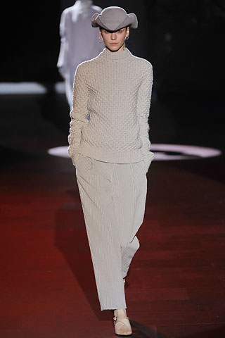
Here's a pretty sweater from his Fall 2008 Ready to Wear collection.

Let's  have a closer look.... 
You know, Marc really is a genius, but I think I could come up with that sweater too...
Oh look, here is that honeycomb stitch pattern
Now, to find a suitable sweater pattern to hack... This could work
All one would have to do is eliminate the cables, add the honeycomb stitch pattern all over and change the collar & hem to have ribbing.
 
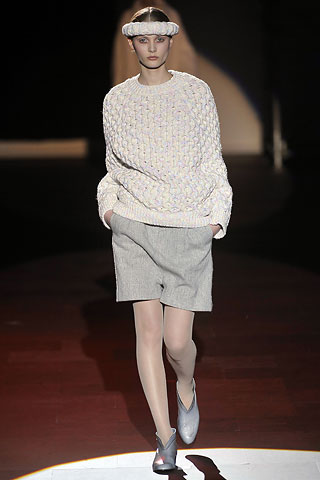
Here's another MJ sweater I like. Chunky & raglan, yum!  
I could really see myself making this one. I'm a sucker for chunky fast knits. 
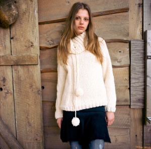
Here's the pattern I'd hack for it.
*All the pics that are NOT Marc Jacobs are all from www.lionbrand.com. 

Thursday, August 21, 2008

She knits too!


Original Ann's new sweater
Originally uploaded by _rebekka
This gorgeous sweater was designed and knit by a very talented photographer in Iceland. You may have seen her amazing photos on flickr.

Tuesday, August 19, 2008

The Paul Poiret Pattern Puzzle

Last summer the Costume Institute exhibition at the Metropolitan Museum of Art featured an amazing collection of clothing by Paul Poiret.

I didn't know much about Poiret prior to seeing that exhibit and since I'm not very eloquent and this isn't an essay for credit I'll just say it was awesome and beautiful and I loved it. The illustrations and the colors and the silhouettes where amazing. The show made me want to go home and paint with my watercolors and drape myself in yards of silk charmeuse.

My favorite part of the exhibit was this wrap dress, which has stuck in my mind ever since. I think it is because I had a "one-peice pattern" project when I was a fashion student. My dress was similar in some ways... it was a wrap with a simple front closure and pleating across the waist, but Poiret's dress is far and away better than mine.... (giggle) I think I used a plaid!

At the exhibit, this dress was displayed behind a fancy shmancy screen and there was a hologram projection that showed how the piece was draped in 3-D. Very cool. Someday I might drape it for fits and giggles, but in the meantime my antsy left brain has been thinking about what the pattern should look like and I have come up with this:

There is a back and a front torso sloper in gray. The red lines represent slashing and spreading to close out the darts. The blue lines are my Poiret style lines. The dashed line across the back waist is meant to be cut and the lower back portion gathered (or pleated, I forget now - how sad) to create a bit of a bustle. The real thing was unlined silk so it had a very bohemian drape.
Now, Poiret didn't draft a pattern, he draped it... and voila, it was fabulous!.... but I like puzzles and if you didn't get a chance to see the exhibit's super cool hologram I think the flat pattern explains it pretty well.


Saturday, August 9, 2008

Friday Night Knits

I rushed home on Friday to finish up my first Ravelympics project. 

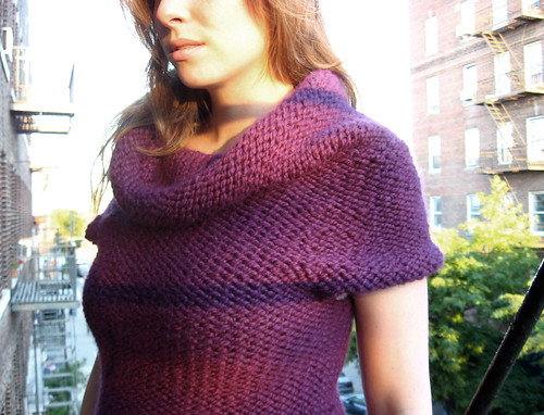
Pattern: Twinkle Shopping Tunic
Yarn: 4 Skeins Lion Brand Thick & Quick; Color: Plum
Needles: Sz 17 Circulars
Team Hopelessly Over Committed, Event WIP Wrestling

I modified the Gauge to fit my yarn. After swatching and some damn math, I used a stitch multiplier of 1.25. That ended up meaning that I could follow the largest size as given in the VK Holiday 2005 version of this sweater. The VK pattern says to knit the first 4 rows in garter, which I did and I like because it doesn't curl at the bottom and you almost can't see it. I also omitted the pockets since I have enough bulk around the tummy (working on that). Other than that, I followed the directions as written in the book. 

So as soon as I finished the cowl and wove in all the ends I threw it on  (I don't look like a cow in it! JOY!) grabbed my camera and headed for the fire escape for some natural light and a self styled photo shoot. 

Everyone's a critic.

Then, I realized I was late for my date so I threw on a dress, inconveniently forgot a sweater and jumped on the N to Coney Island. My next Ravelympics project came with me, but more on that another time.

I met up with the Boy at Nathan's were my newest favorite guilty pleasure is the Lobster Sandwich. Seriously,  since they started listing the calories of everything it is incredibly easy to make the "healthy" choice. Besides, when was the last time I had a $6 lobster sandwich? Yum.
So while we were downing our extra large Killians (so much for healthy) we were pleasantly surprised by fireworks! I had no idea they are doing fireworks this year. It thought that all the development talk might have put an end to it and I haven't heard anything otherwise. The boy and I will definitely have to come back again before the end of the month for more. Next we played a round of Shoot-the-Star and then headed over to the Wonder Wheel (no pics - oops).

Should your future need divining. She's waiting by the Wonder Wheel. 
Incidentally, it's the Wonder Wheel's 88th birthday this year. 
Another Ravelympics project - my 2nd Spring Forward Sock. Team Hopelessly-Over- Committed, for Event Wip Wrestling. YES, I always carry 2 projects with me at all times. Variety is the spice of life.

And lastly, what's thrilling, costs a dollar, and "don't GITMO better" ??

Tuesday, July 22, 2008

Help me! I don't know what to do!

I am nothing if I am not indecisive. It's a flaw of mine.
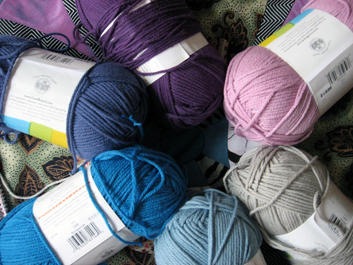
I bought a bunch of colors for the Confectionary tank and this is my swatch. 


In case anyone who might be reading this hasn't already seen it on my Ravelry page,  the yarn is Lion Brand Cotton-Ease in Stone, Lake, Turquoise, Violet, & Plum. I love that the colors are analogous, cool, and have a sort of ombre thing going on, but I do not dig the stone (light grey) next to the plum. It's too abrupt. I thought I'd add a cool pink to the palette to bridge the tonal gap. I added Blossom and to my project stash and I thought/think it looks pretty good. I decided to simply insert the Blossom between the Stone and the Plum and knit this pretty baby up.  


I cast on (while watching Bikini or Bust - how appropriate) and knit a bunch of repeats. Then I decide that I don't like the Blossom after all. The tone isn't deep enough to please my eye... and the added pink next to the purple is looking a little saccharine. (If Cactus and Lime had only looked better I would have taken the tank in the green/blue/purple direction.) 

I ripped out several repeats and decided to re-think my color pattern. I REALLY dig my swatch.... except for the Stone on Plum action. I decided to focus on what I liked about my swatch... the ombre-like order of the colors... and I've decided to have the colors vibrate back and forth between the Stone & the Plum. I'll use Stone for the trim  which will help to minimizing the effect of the purples. Great, I love it. 

I knit one half a repeat.... then I realize that I started with Lake... and I want the bottom color to be Stone. 
I also realize that this tank CURLS at the hem as stockinette only does (duh, Grace) and even though the project pics Show this, I don't like it. 

Incidentally,  I am very critical.... that might also be a flaw. 

So do I frog completely and start over with Stone? 
If so, should I knit a few rounds in Garter to make a firm bottom trim?
Do I proceed as is and pick up and knit a Stone border after the front and back are sewn together? Should it be garter? Or perhaps a short ribbed band?

I am paralyzed by indecision.

And since I can't decide if I should rip or knit, I switched to my neglected Bella Blouse.... which had previously caught me in the indecision trap... and I bravely cast on for the body in the round. I think I am in desperate need for some simple cotton stockinette for a bit. I'll have to blog about that later though.... I only have sufficient light/time in the morning for pics.

Monday, July 7, 2008

At home steam setting

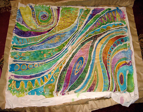
This past spring I took a textile painting class at FIT. I didn't get a chance to steam my last project because I painted it on the last day of class, so when I had a chance (read: needed a break from knitting my Mesh/Rib Pullover) I steamed it at home in my kitchen. This is much more involved than it would have been in class, primarily because our kind TA did all the work for us. 


Taken in class while painting.


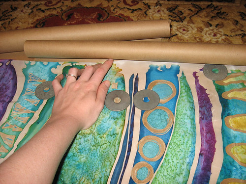
Rolling the painted silk in brown craft paper. Craft paper was purchased at Duane Reade. Blank newsprint would work fine also.


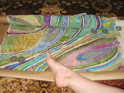
The craft paper wasn't very wide so I had to use 2 pieces over lapped. It was also very curly so I had to use my handy washer weights, my 2 hands and a foot. (I'm impressed that I was able to capture this moment on camera.) I left about a foot of paper at the end (center of the roll) to fold back over the inside edge of the fabric. I was careful to smooth out the fabric as it was rolled so that there won't be any wrinkles or dye transference.


Taped up the seam and the ends. It is important that the paper is permeable to the steam, and there is nowhere for water to splash directly onto the fabric.


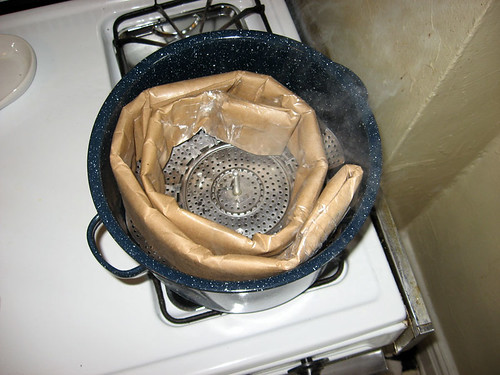
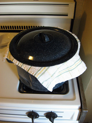
I used this old stock pot (that I use ONLY for dyeing) filled about 2 inches with water, and placed my steamer on top of a shallow baking tin for additional lift. Once the water started to boil I coiled my paper wrapped silk and fit it gently in the pot, and was cautious to avoid splashes. I reduced the heat to low, and let steam for 2 hours.


I put a folded kitchen towel under the lid to prevent the condensation from dripping back onto the paper which could cause water marks if water seeped through onto the silk.


I think I did get a water mark or two because in the end the kitchen towel touched a small portion of the paper... but since my painting style is watery and I used some cool salt blending techniques it is hard to notice the spot and it doesn't really look like a mistake. I learn by doing and messing up anyway!


After steaming, I washed the painting in cold water to remove the excess dye. The most important thing I learned from my first project (not shown) is that the fabric/silk must dry so that it does not touch itself. Even when the water runs clear and it looks like all the dye is out, this is very important to avoid dye transference. It was kinda tricky to rig this set up in my bathroom so that the entire piece of fabric touched nothing but the clips. Luckily, silk dries very fast.


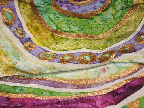
Some lovely details.


In case anyone wonders, I was inspired by the Gustav Klimt exhibit at the Neue Gallery - the Adele Bauer-Bloch painting in particular. I think the show is over now... but if it's not, I do recommend seeing Klimt paintings in person. There is a depth of texture in his paintings that simply cannot be seen in a photograph.

I used clear wax batik and gold Jacquard gutta resist, Senelier dyes, and a whole lot of kosher salt. I'm a bit of a control freak and I usually pre-plan projects, but since this was the last day of class I decided I needed to take advantage of the lab time and exercise my right hemisphere. There are things that I like and don't like about this piece, but it was good to get it done fast because I learned a lot that I can use next time.
Related Posts Plugin for WordPress, Blogger...